Let's Go Outside Revised Website
Case Study: Let's Go Outside Revamp Live Site.
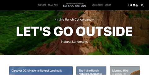
Let's Go Outside Revamp Live Site.
Project Goal
Responsive web improvement on local nonprofit designed to get people out into the Irvine Ranch Conservancy. Redesigning site, responsive, information readily available, usefulness of site on mobile tablet and web. Concept created in two weeks by unaffiliated team of 3 (Cheikh Clark, Van Lee, and myself)
Project Focus
UX Research, UI design, Low-fidelity Prototyping, Digital Prototyping,
Front-end Web Development
My Role
UX Research, UI Style Guide, Storyboards, Responsive Home Page, Website Navigation, Repository Management
Tools Used
HTML5, CSS, JavaScript, Sketch, Adobe Illustrator, InVision, Google Forms
Final Project Deliverable
Multi-page Responsive Website: Click Here for Live Site.
About
When thinking of the Irvine Ranch Conservancy (IRC) and all the land that is within it, most people don’t have a clear idea of how much it holds and all the activities available within it. The Let’s Go Outside Organization is a subsidiary that tries to educate and bring people to the land. There are 40,000 acres of open space on the historic Irvine Ranch that have been designated a Natural Landmark.
Overview
Everyone on our team enjoys going outdoor to hike and/or mountain bike on trails like the
ones in IRC. We all frequently go out on the weekends for this type of activity, so we
were very interested in an organization that could teach us more about the trails around
us. At a glance we noticed that their current website does a poor job of being responsive
and that the information they provide is hard to access or decipher. We wanted to see
if any one else shared the same problems and if we could make improvements on the site.
Let’s Go Outside was designed to connect the public to the land, showcase the beauty
of the parks, and have them participate in recreational activities. Part of that is creating
trail awareness and informing the public on the opportunities that exist in the Irvine
Ranch Conservancy.
We observed that the site isn’t very effective in conveying trail information and everything
that a hiker would want to know before heading outside. We decided to focus on a hiker
even though they have information for mountain bikers and equestrians as it it most easy
to pick up and find users interested in the activity.
While looking at the site, we decided to improve the way they educate and provide information.
We want to make it easy to digest, easily scannable, and sectioned in ways that is more
intuitive or searchable.
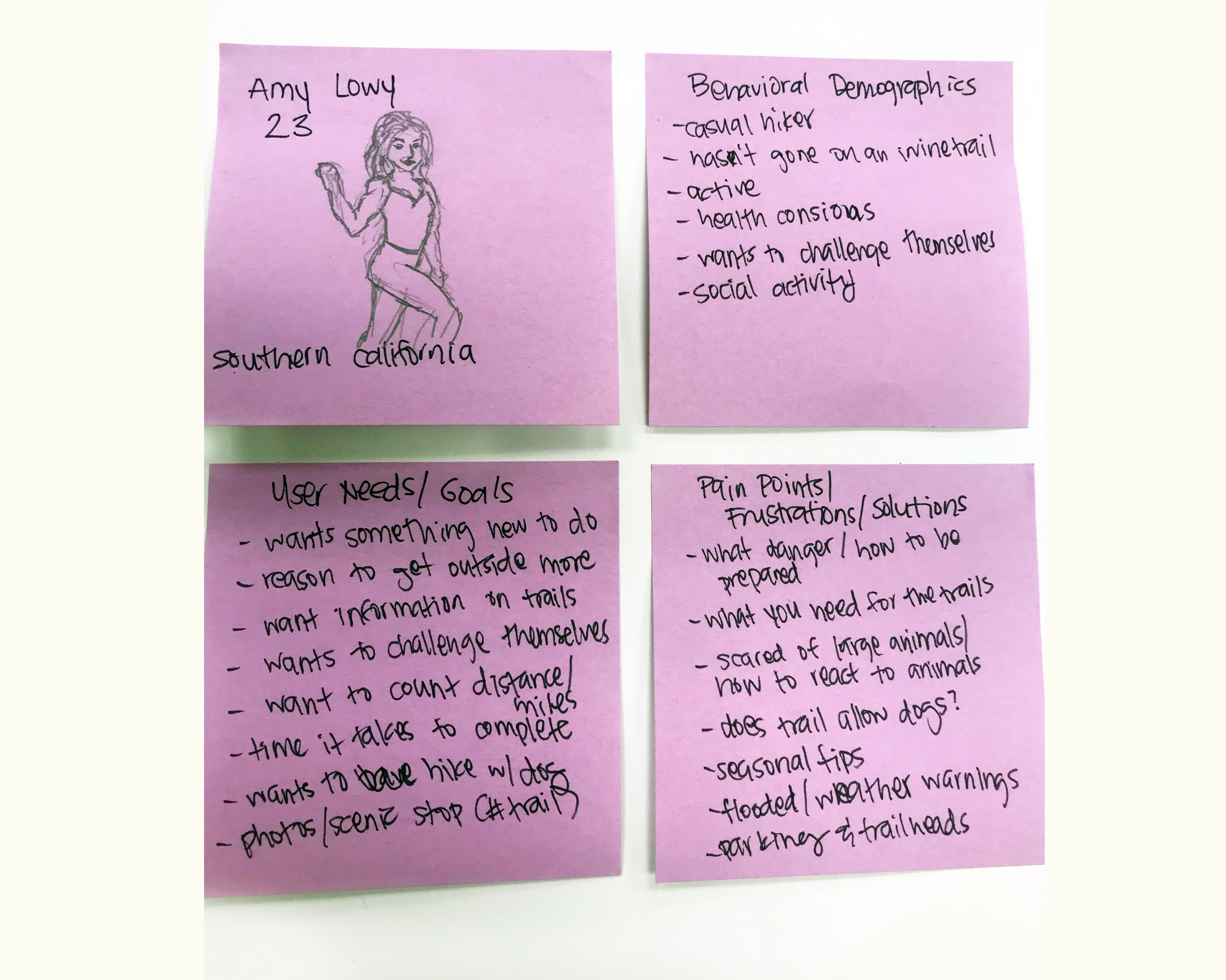
User Persona
Starting with user research of current website, we pinpointed problems it currently has.
I had a casual hiker go through the site as though she were picking a trail to hike for
the first time with her friends. I recorded and observed her pain points with the current
site, while she tried to navigate it. In the end, she was able to find minimal information
and described what she wished she could have available on the site.
The persona was based on this interview. She is a local who hasn’t visited most of the
trails in the conservancy even though she does go out hiking with some frequency. As
a casual hiker, she wants to visit more parks and trails near her home, but want to be
able to find information to let her know what to expect when visiting a trail.
Research and Observations
The problem with the site is that no one knows very much about spaces that are just a few
minutes away, so people don’t take advantage of it as much as they could. Their videos
have on average 136 views and they have videos from 2 months to 6 years ago that aren’t
doing much better.
The site is there to show what is in the parks and relay to people why they should care.
To find how to best connect with the user and make the sire useful to them, we conducted
a survey. What would make this a useable site that a casual hiker would want to share
with friends and family?
We focused our efforts into displaying information our user wanted to see based on our
interview and our data from the survey. We found out what people want to see when picking
a trail and we discovered what other information people would want to know to feel prepared
and safe.
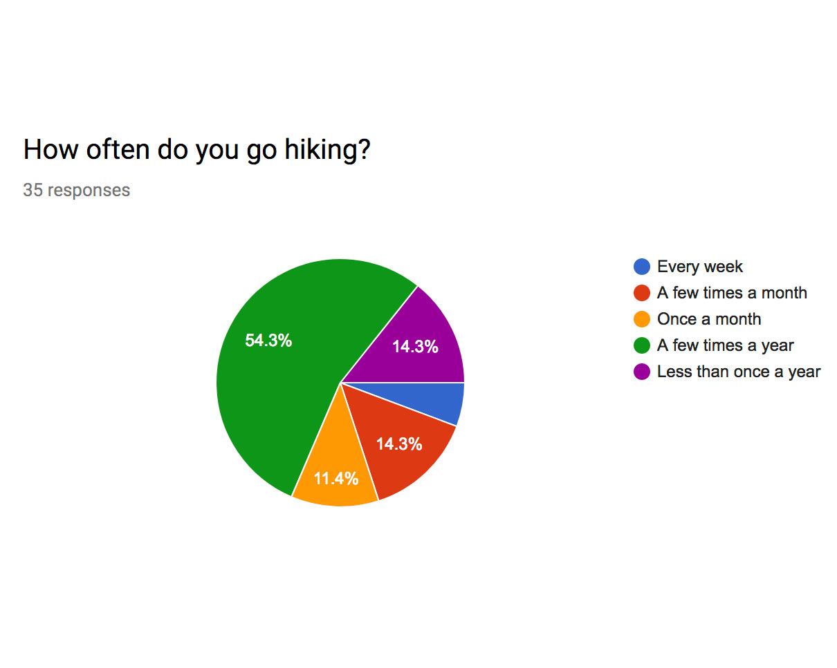
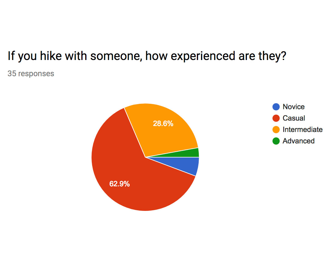
A wide range of users took our survey; they ranged from 22 to over 65. They all ranged
in how often they hiked, with most going just a few times a year. Most of them considered
themselves casual hikers and go out on the trails with people that have similar experience.
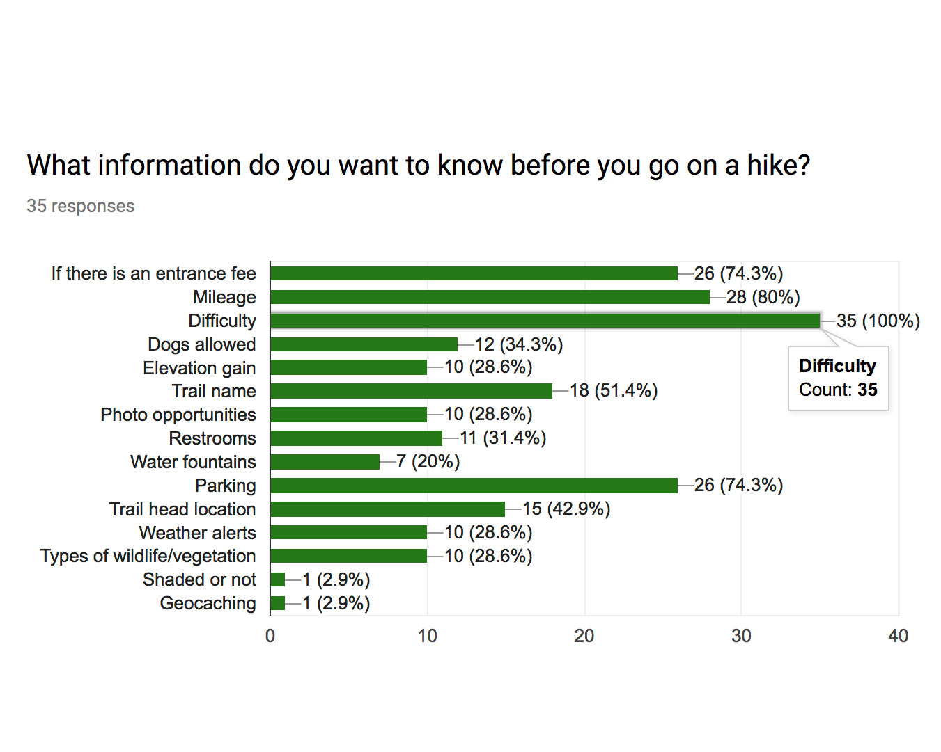
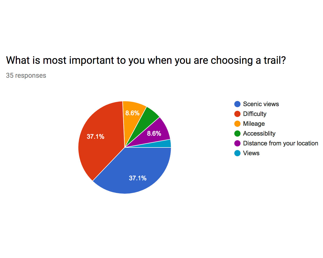
The users ranked and selected what information was most important to them when looking
up trails. We also found what other information they would be interested in, such as
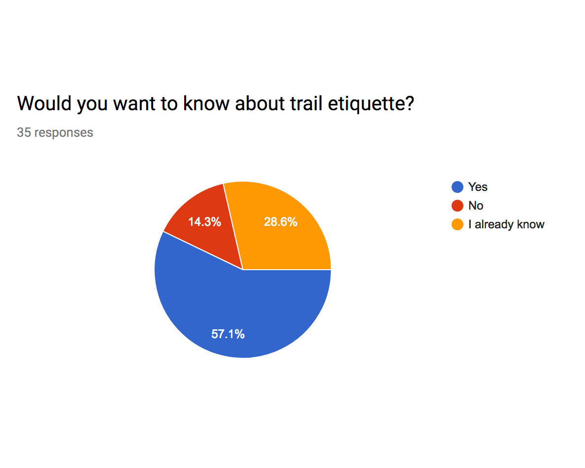
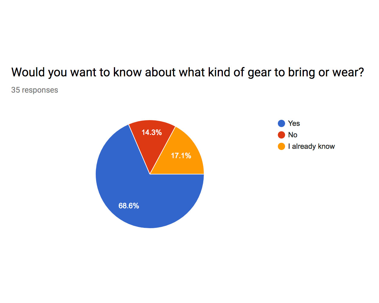
what gear to wear, trail etiquette and how to stay safe.

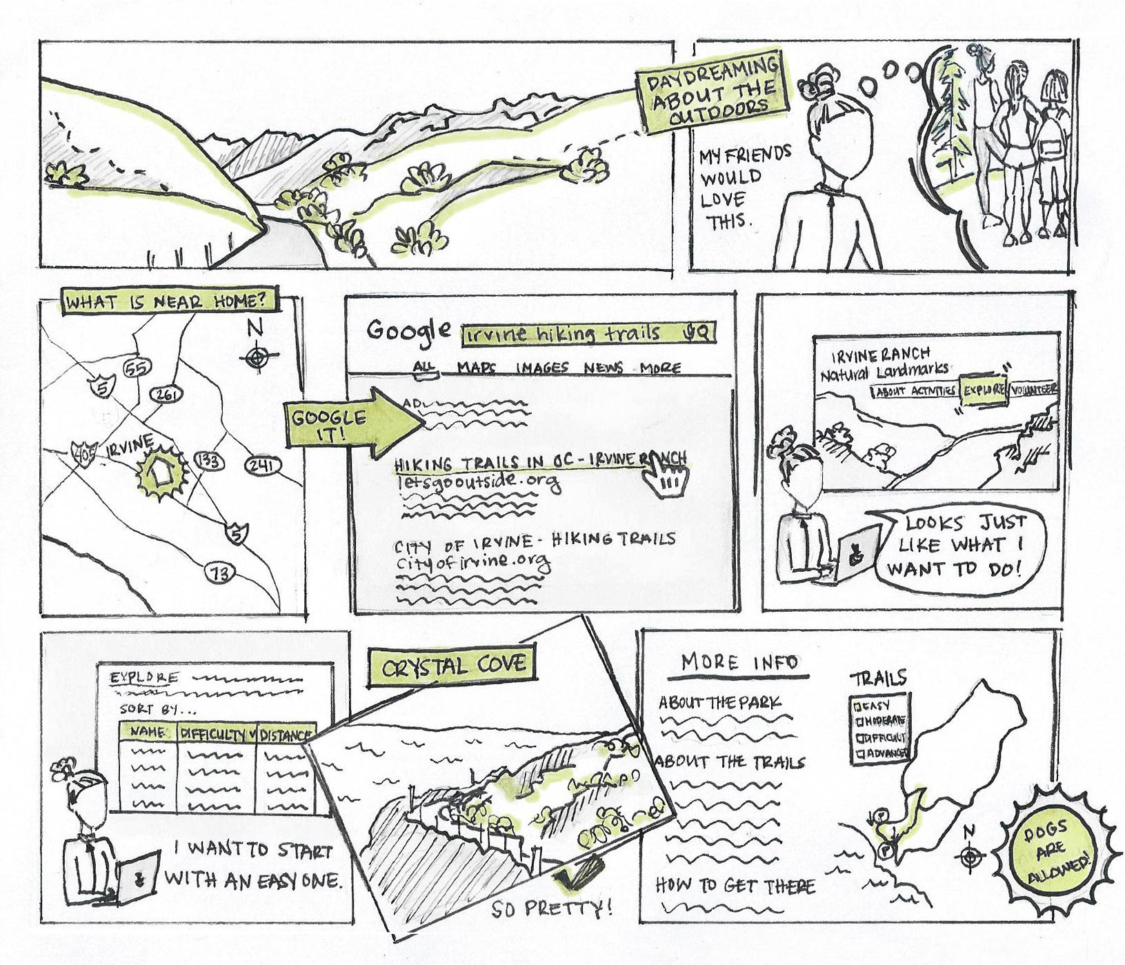
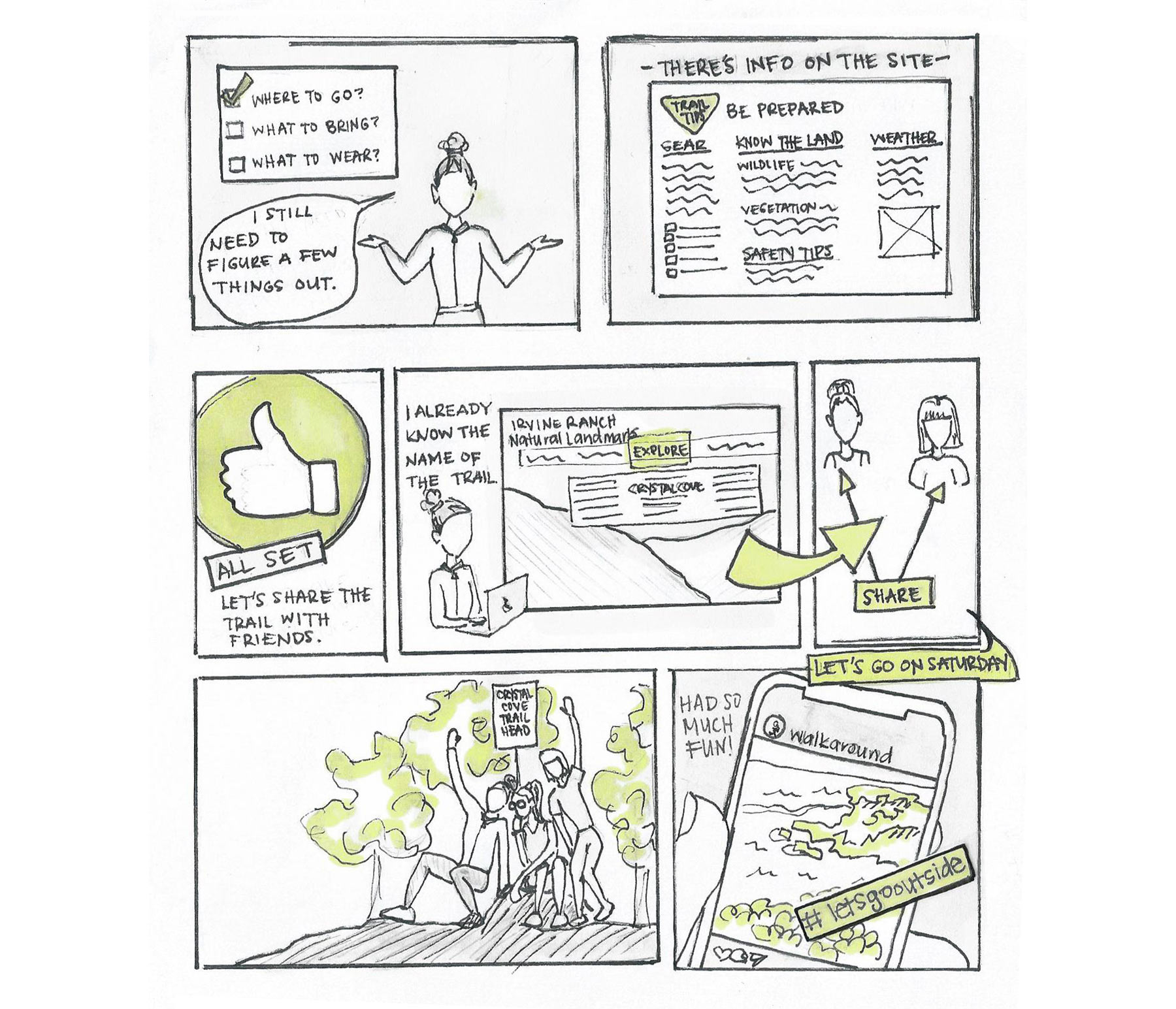
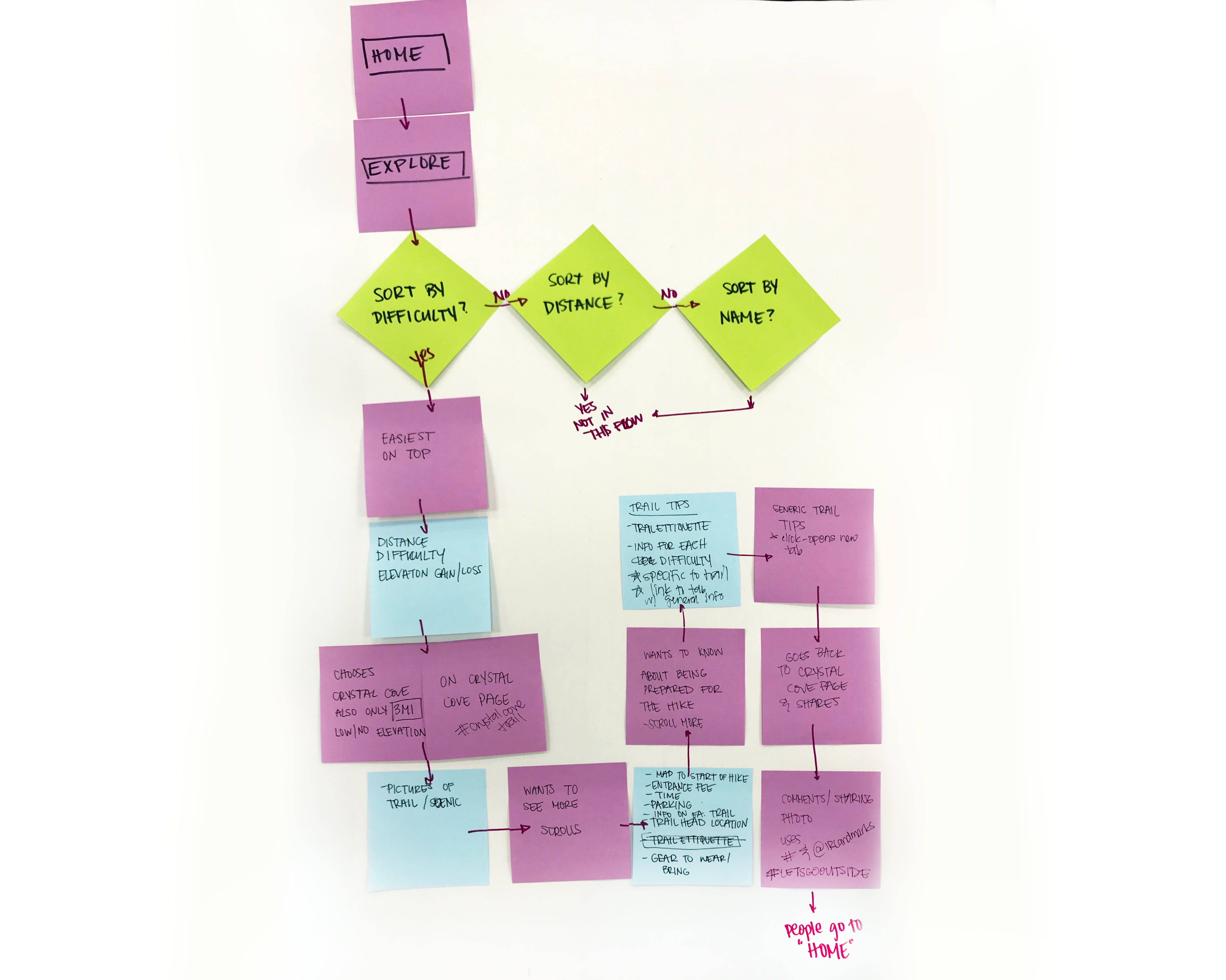
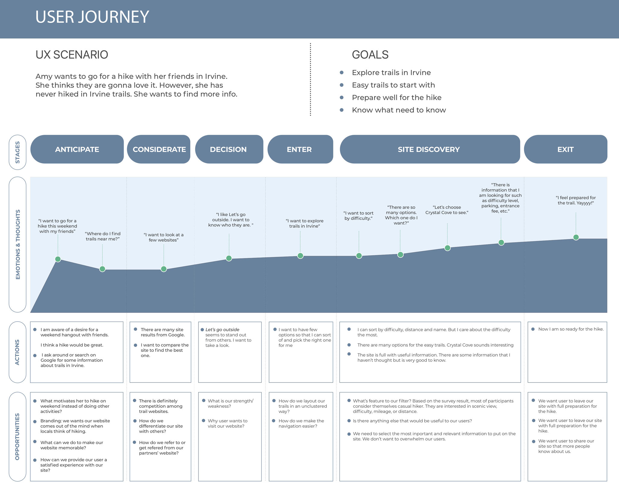
Storyboard and User Flow
Before fully coding the pages we started with a user flow. With the information from the
user interview and survey, we depicted a flow of a user that would search for a hike
based off of difficulty, learn more info about the trail chosen and be able to share
it with friends.
Then, I took our user flow, user persona, and user journey to create a story board showing
the steps a user would take from before interacting with the site all the way through
sharing information with their friends and social media -- which would be the ultimate
goal, to get more users to the site. Through this we decided what pages we'd focus on
coding and how we would navigate through the site to show the initial design.
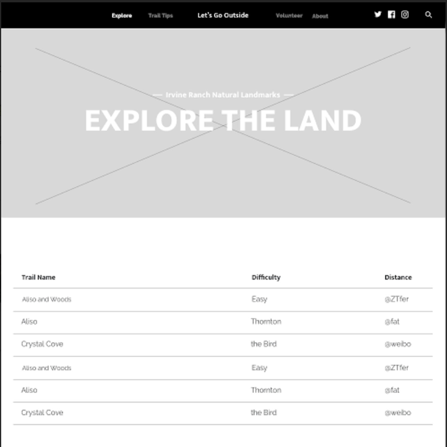
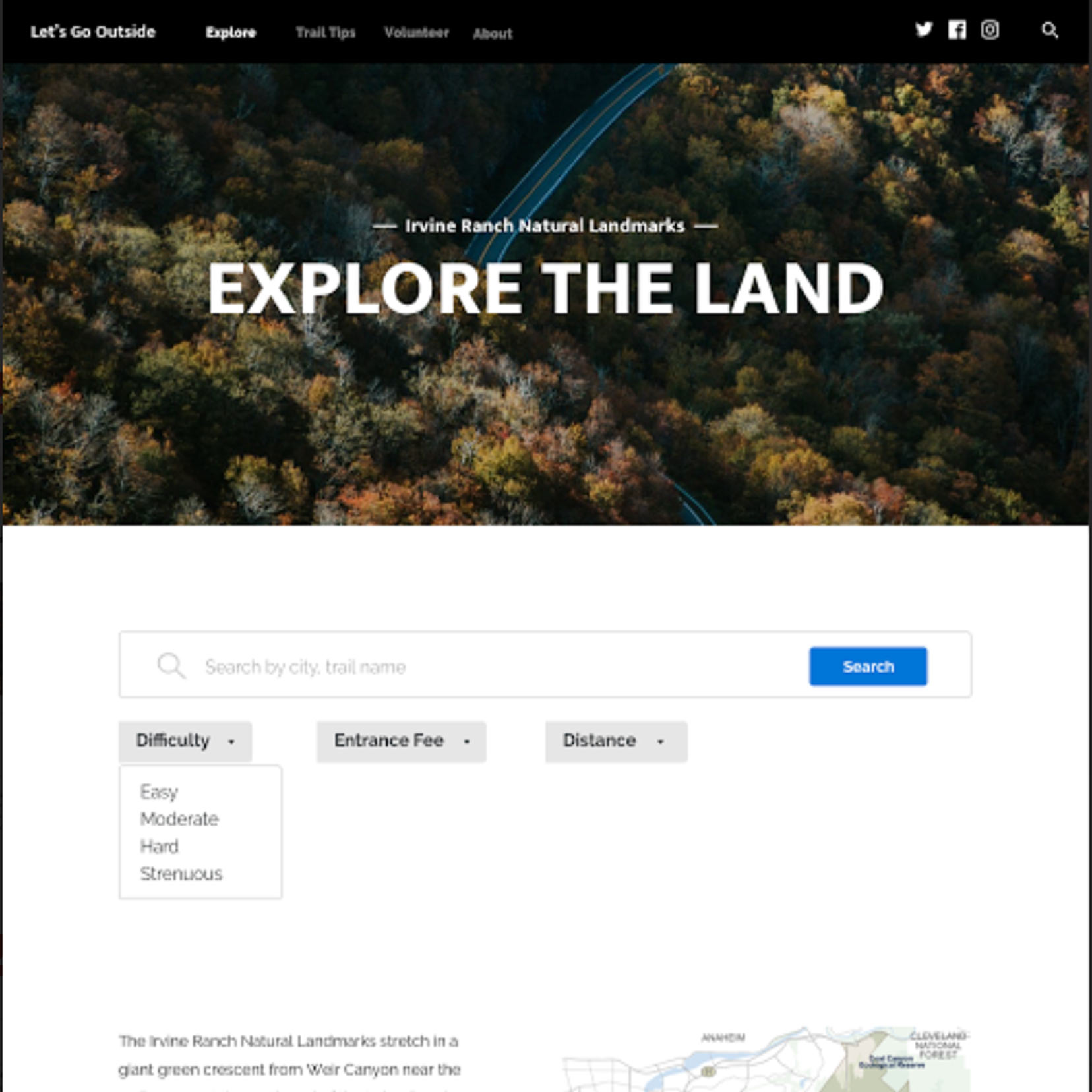
Designs and Prototypes
With the flow, we created paper wireframes, which Cheikh created into digital wireframes
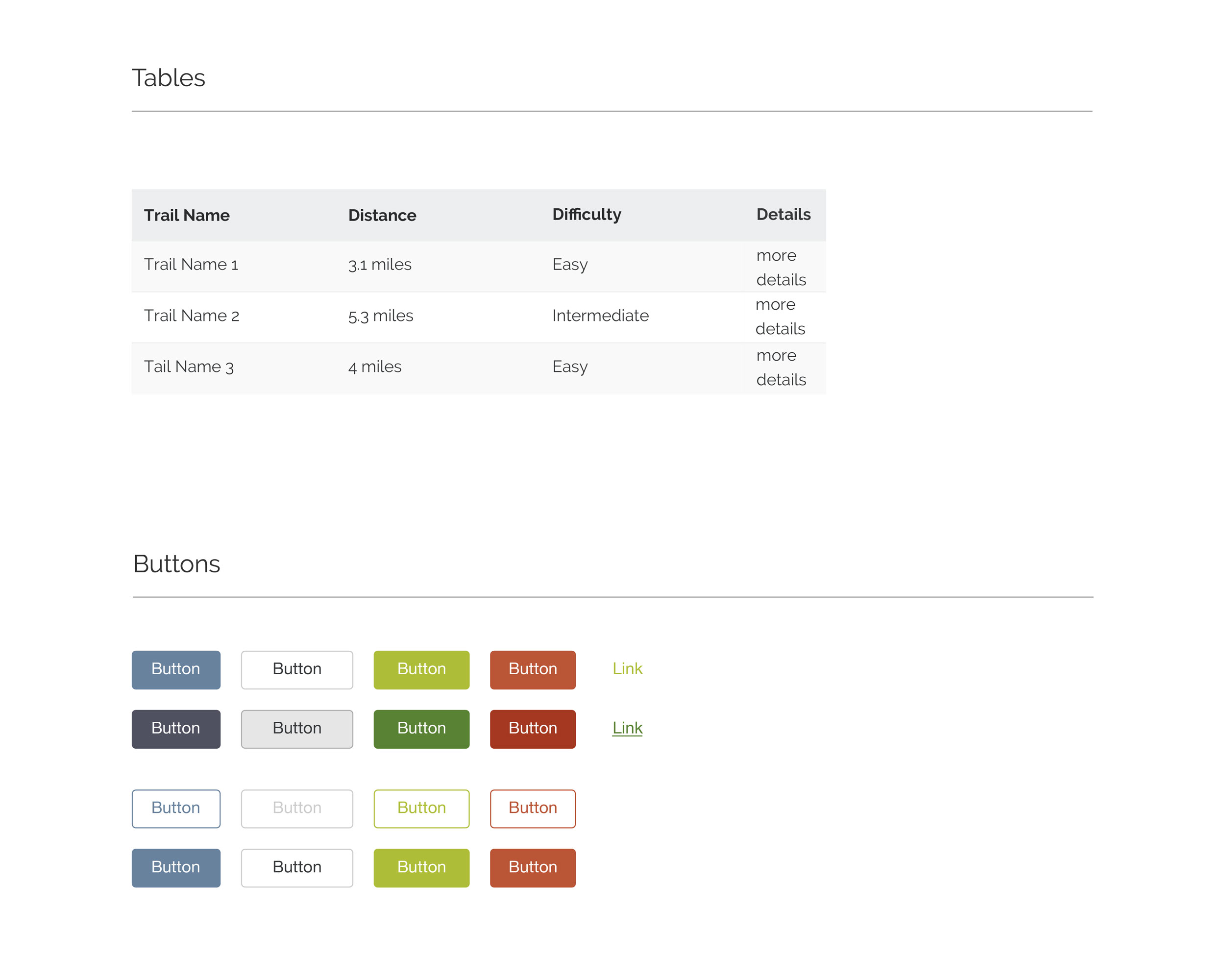
that we tested in inVision. We tested drop down menus vs sorting tables. For our
user, the table worked better because there is greater visibility of multiple pieces
of information at the same time. A user can sort and view by difficulty, distance,
and trail name to find a link they are interested in.
Our high level goal was to be able to search a trail and find relevant information
that was previously buried. We came up with new ways of displaying information and
pages that are more image heavy since users want to see what the trails look like
before going on them. The experience on the site is made to be scannable and use
minimal navigating with single pages for each trail.
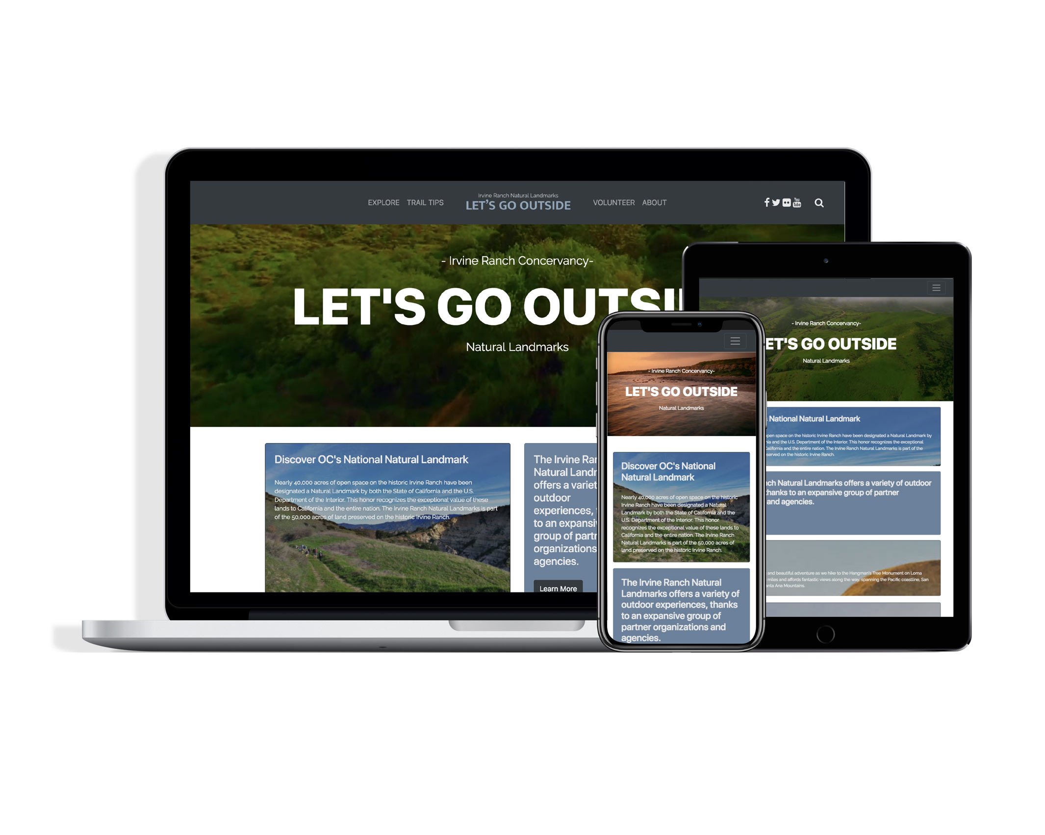
Final Prototype and Reflections
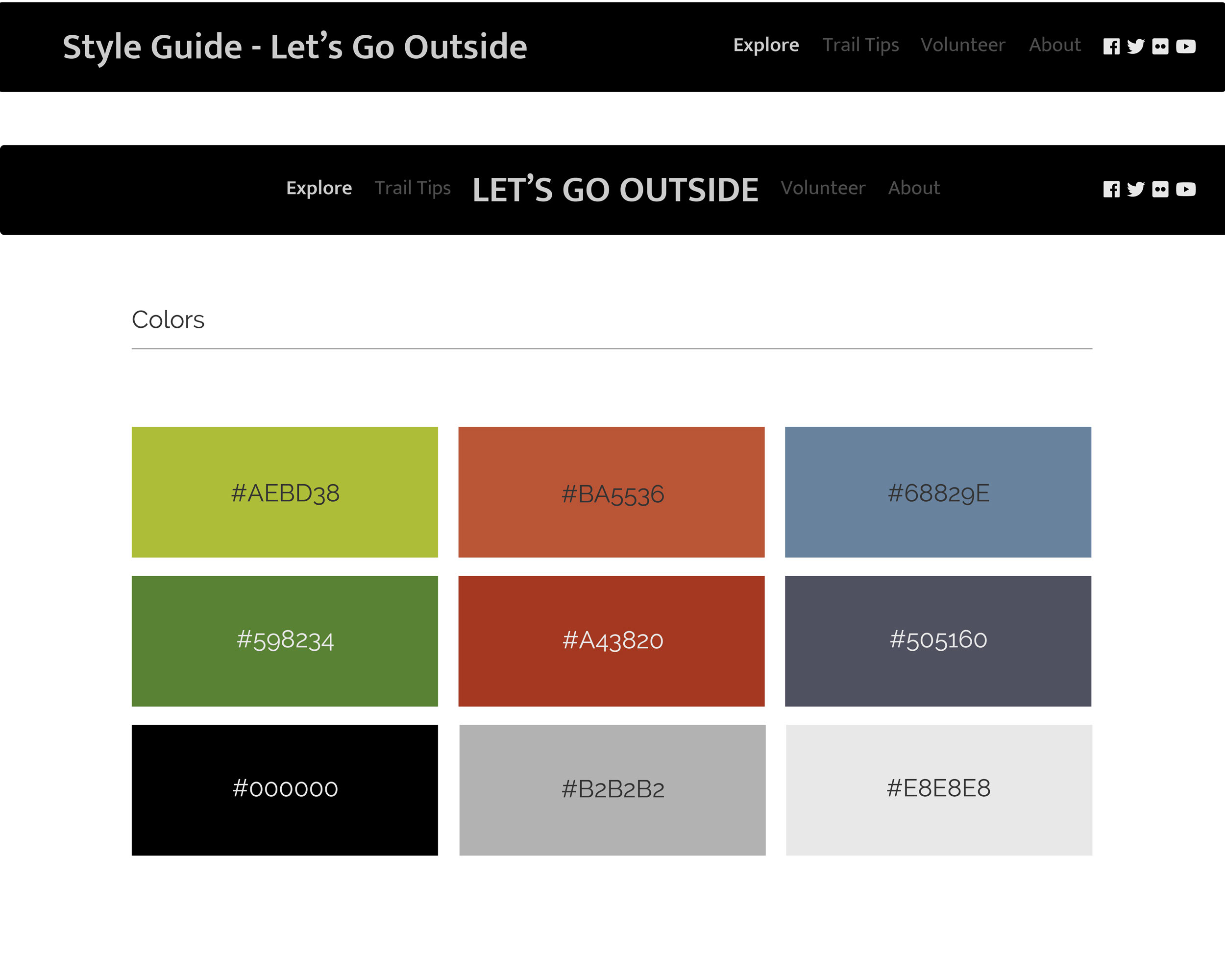
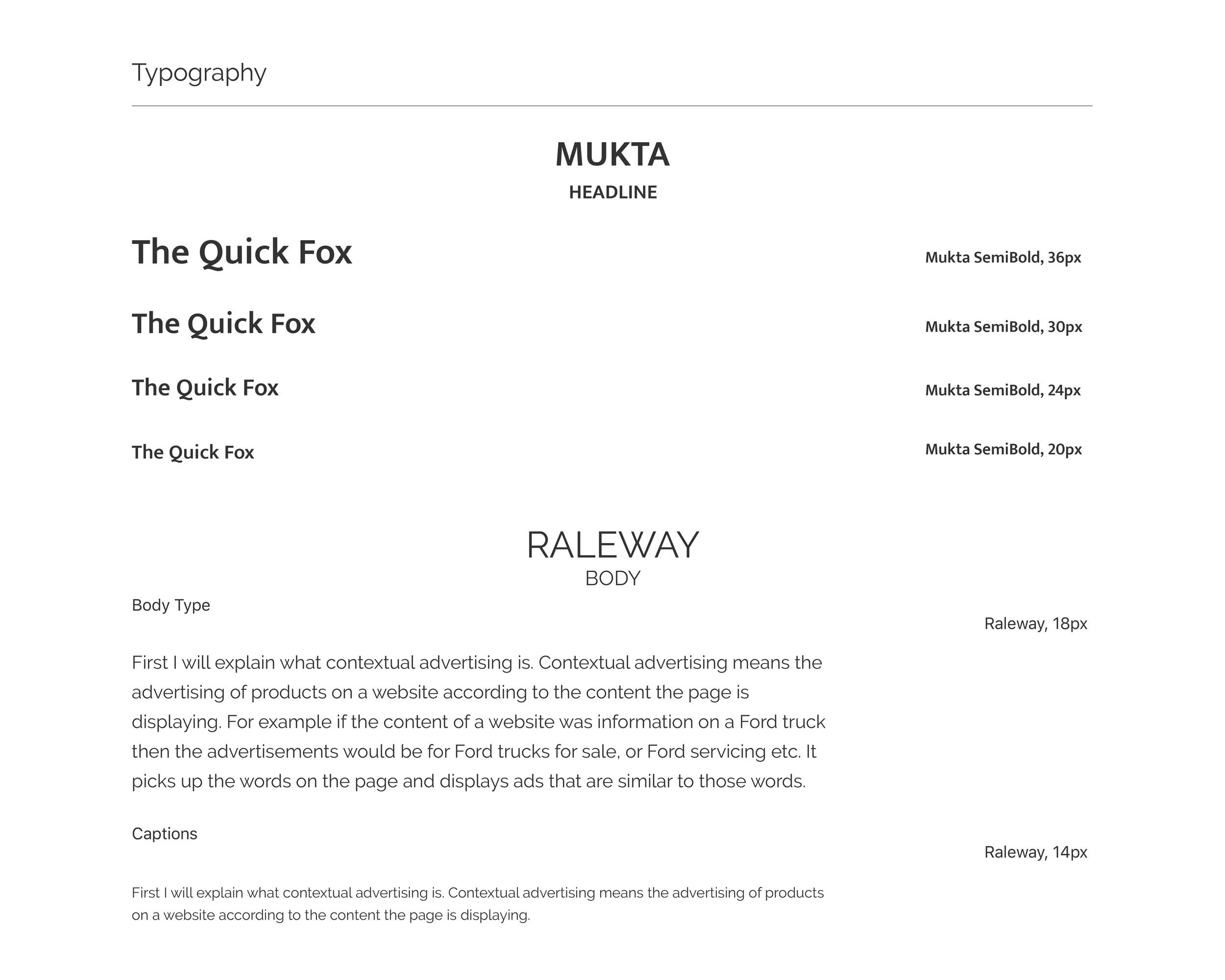
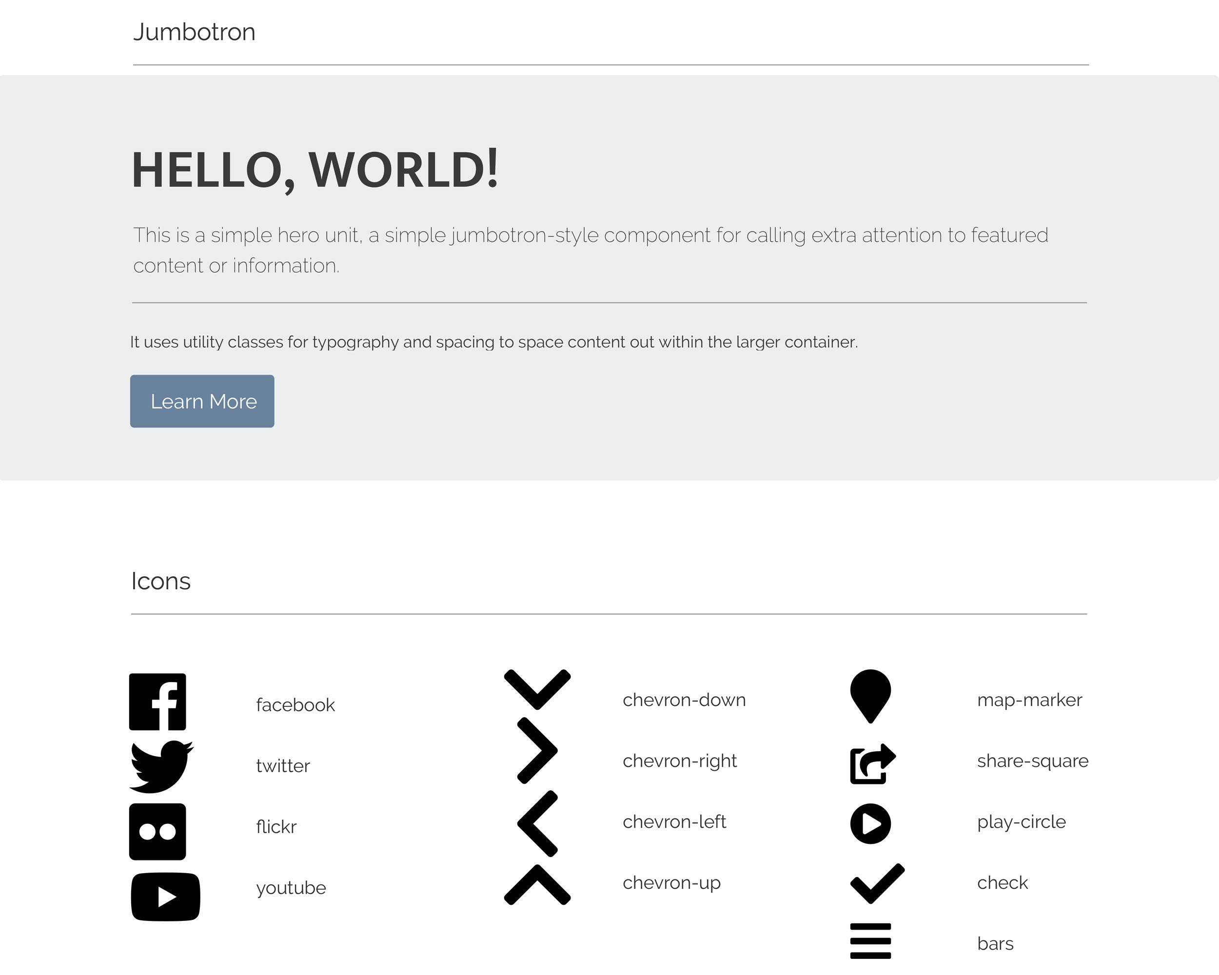
I created a basic style guide for our redesign with ideas we all came up with. By
doing this, we were able to keep a consistent aesthetic throughout the site.
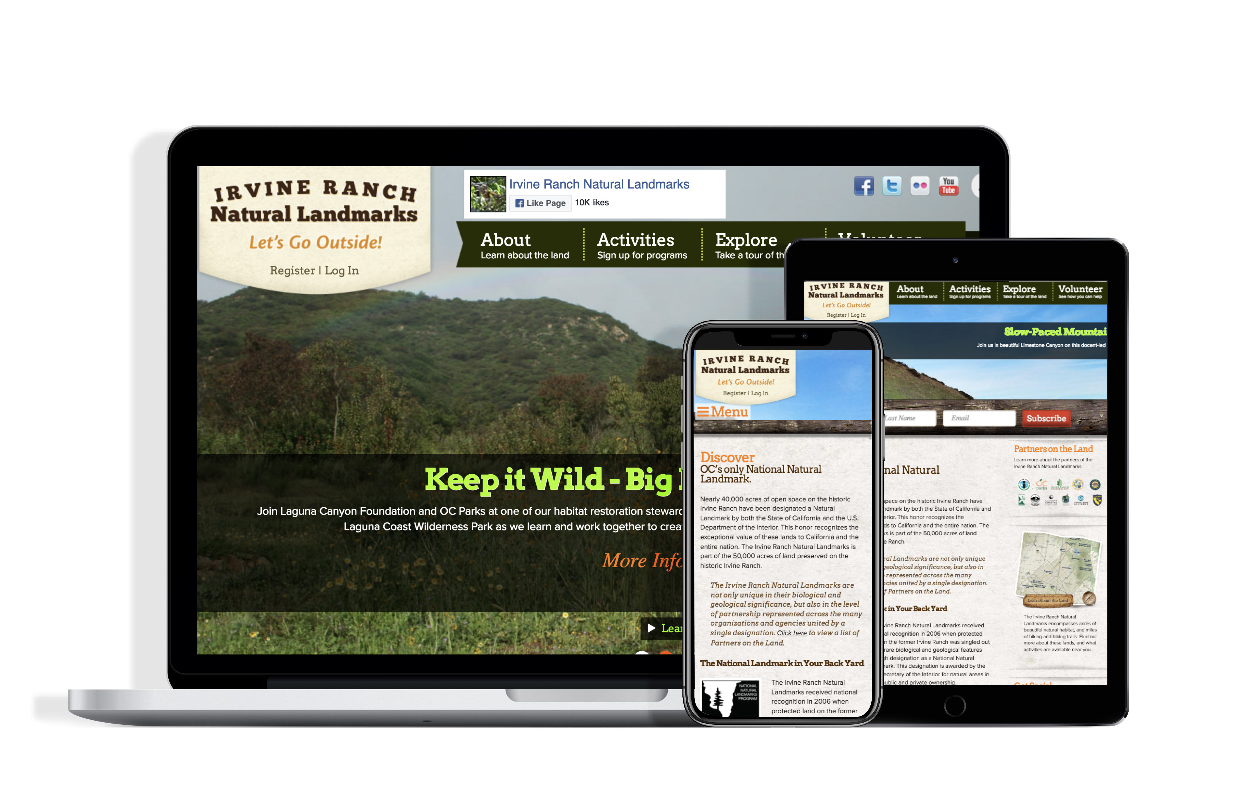
As a team we each took a page to code -- I created a fully responsive homepage
as well as the navigation bar and sorting data table. We had the idea to create
a template based approach, which is a scalable model that can apply to other
trails as the site grows.
Goals for future iterations would be to make all the pages fully responsive
and to add more visual content to the other pages to have them recreate the experience
of the homepage. We would add an interactive aspect to the site and be able to
search for trails through an interactive map as opposed to a table. I would also
feature more social media on the site and have people use #letsgooutside. I would
have an instagram feed including media from users based on location and the hashtag.